
Logistics is definitely one of the most time-critical industries there is. It is also one that involves a lot of interdepartmental coordination, documentation processing, and compliance maintenance on the go. Hence, most logistics applications bear the burden of needing to enable quick access to multiple service functions without cluttering the app or compromising the compliance processes. Our client was facing a similar issue when they reached out for a UI/UX solution that would not only improve the efficiency of the application but also offer better user experiences.
Requirement by the Client
Our client, who leases, services, and maintains semi-trailers to companies of all sizes, was unhappy with the layout and design of their existing application interface and requested a complete revamp. Based on the feedback they received from their clients, the application was difficult to navigate and time-consuming when trying to request time-critical services. Our client believed a design revamp would be instrumental in fixing the problems.
Identifying the Real Problems
Our design team reviewed the application and quickly determined the app desperately needed a UX revamp, not just a design makeover. Here are some of the glaring issues we discovered during our initial analysis:
Information Density: The main user interface was densely cluttered with all kinds of information (some relevant and some redundant) about services and assets, making it very hard for users to quickly navigate within the application.
Unsatisfactory User Journey: At various points within the app, the user was required to complete redundant compliance steps to utilize time-critical features like ‘Request for Roadside Assistance’ or ‘Status Updates.’
Design Inconsistency: The existing UI was not supportive of the app’s functionality and intent, and needed major improvements. The core design was not empathetic to customer needs.
Research Insights and User Persona
Like all UX projects we undertake at Expeed, this one too meticulously followed our UX Process – a tried and tested formula which was developed to ensure that the apps we create are robust and scalable. Client and stakeholder interviews were conducted to fully understand the scope of services being offered by the company, and to approximate the delivery timeline expectations. A user persona that was drawn from customer profiles of similar logistics company managers and entrepreneurs was then used to derive an empathetic understanding of the app’s requirements and use cases. The team recreated the emotional temperaments and expectations from a user standpoint to identify all touchpoints that would benefit the most from UX enhancements and help make the app significantly more intuitive.

The research allowed the team to draw definitive conclusions about the ideal responses to various app scenarios – a critical element to generating the best user journey experience. This also paved the way for creating workflows and a design system that gave prominence to time-critical features and reduced redundant compliance processes.
Problem Solving and Ideation
Once user expectations and requirements were identified, we zeroed in on all the problems with the existing app and any potential additional issues that may crop up while revamping the application. The issues were first categorized broadly based on service functionalities and their significance and contribution to achieving the overall business goals of the client. Creative brainstorming sessions were then conducted to derive the most feasible solutions, keeping in mind the practical limitations users might experience under different circumstances. The iterative ideation process enabled us to come up with unique features, tied to more efficient workflows, that enabled the application to respond better and coordinate between user demands and business requirements.
The Revamp Process
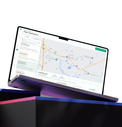
Once the blueprint for the user journey was ready, we dove headfirst into the details of design and feature implementation, starting with the fleet dashboard. As the primary user interface, and as one that is expected to make or break app engagement, our first task was to simplify and bring order to the dashboard. We started by categorizing information and grouping them under related services/functions. All time-critical information, like locations of trailers, requests for roadside assistance, active routes, service maintenance updates, etc., were given more visibility, while less time-critical details like trailer contracts, asset information, etc., were tabbed. While the status of vehicle services was given priority on the dashboard, the details of the repairs were made accessible only upon clicking the ‘More Details’ button.

Process Improvements
A great UX is one that understands the importance of customizing solutions for user needs and improving the heuristics or the speed of use. It is essentially the time taken by an app to perform a task (or a set of tasks) requested by the user. This often goes hand-in-hand with customized solutions for specific user needs. For instance, the time taken and complexity involved in fixing a flat tire depend on the size of the vehicle and its location accessibility. The heavier the vehicle, the more urgently the app needs to push the request to concerned managers. Hence, we changed the task flow for flat tire requests and customized them based on vehicle type and location. Such improvements not only helped the user have a more satisfying experience whilst using the application, but also helped the business save costs by reducing response time to repair/service requests.
Here are a few other touchpoints within the app that benefited from process/navigational flow improvements:
Complaint Registration: By removing some redundant steps, we reduced a 7-step ‘Complaint Registration’ process to a simple 3-step solution, without compromising on any compliance requirements.
Non-Critical Preventive Maintenance: Users who needed their trailers checked for multiple non-critical repairs could make an appointment for a single day of maintenance and servicing based on when the trailer was available or not scheduled for any deliveries. To save more time and cost, a feature was added to suggest the nearest service facility based on the current location of the trailer.


Intuitive Communication
Updates, alerts and notifications are an app’s way of reminding its users that it is constantly working to serve customer needs. Our team integrated status updates and notifications onto the primary interface so that users could rest assured knowing the whereabouts of their trailers and the estimated time that would be taken to resolve any issues. Alerts about approaching lease contract expiration/renewal dates, DOT compliance check expirations, overdue service maintenance, and pending invoices were also added to the primary interface.
The status updates and alerts were designed into the application to support our client’s customer-first service approach and brand values such as trust and reliability. Additionally, the features supported the client’s offline customer service efforts by reducing actual man-hours and resource costs.
Smart Tracking of Expenses
A very crucial UX feature that was missing in the app’s earlier version was one that allowed users a single point to access all expenses and costs incurred by various assets. Our team liaised with the data analytics team to pull up a comprehensive expense tracker that was visible on the dashboard.The tracker aggregated and maintained cost information about previous maintenance requests, services completed, complaints log, and other trailer-related expenses and presented a summary for the user with insights about trailer efficiency and health. This feature was particularly useful for customers to make informed decisions during lease renewals.
Style Guide
During the entire design process, we were parallelly creating a AAA standard design style guide to support the UI of the revamped application. From selecting the color palette that aligned with the brand’s identity to standardizing button sizes and shapes, we provided a complete and exhaustive style guide that was deep enough to accommodate any feature additions or service integrations in the future. A dark and light theme version was offered to improve scope for customization. The perfect typography and hierarchy to be used across the numerous content spaces within the application were selected based on ease of use and visual aesthetics. The entire work was in compliance with the Google Material Design System and followed Apple and Android guidelines. With attention to detail and an intuitive design direction, we created a roadmap for the application design use and implemented it in our prototypes. The result was a minimalistically designed, clutter-free navigational experience for the users.


Prototyping and Usability Testing
After numerous iterations, we developed a prototype based on the final wireframe and implemented usability testing. The feedback we received confirmed two very important things:
- The application was infinitely easier to navigate, and it recorded better heuristics among the majority of the users.
- The revamped workflow inspired our clients to explore further avenues within their operations where redundant and repetitive processes could be eliminated completely.
Wrapping Up
By eliminating rhetorical permission requests and repetitive user information validation, we increased the efficiency of the application by at least 50%. The resulting fleet dashboard with real-time updates on trailers, routes, service requests, and compliance checks gave our client and their customers access to all time-critical information in one place, thereby increasing their internal productivity and customer satisfaction. As noted earlier, we also provided a style guide that complemented the client’s corporate persona. All in all, we offered a complete UX makeover for our client’s application that directly helped in improving operational efficiency.

Expeed Software is one of the top software companies in Ohio that specializes in application development, data analytics, digital transformation services, and user experience solutions. As an organization, we have worked with some of the largest companies in the world and have helped them build custom software products, automated their processes, assisted in their digital transformation, and enabled them to become more data-driven businesses. As a software development company, our goal is to deliver products and solutions that improve efficiency, lower costs and offer scalability. If you’re looking for the best software development in Columbus Ohio, get in touch with us at today.
Discover Your Path to Success
Ready to tackle your unique challenges with precision? Find out how our customized solutions can transform your business. Fill out our contact form, and our experts will be in touch. We will create personalized guidance with innovative solutions tailored to your business, helping you take the next step to success.
Ready to transform your business with custom enterprise web applications?
Contact us to discuss your project and see how we can help you achieve your business goals.
