Rooted in Design, Joining the No Code Revolution
The digital landscape is evolving rapidly with innovation and user experience going hand-in-hand, almost synonymous with each other. While businesses have their eyes on the democratization of software development, heralding the ‘Age of No Code’, we’re seeing more and more platforms switch appearances to please the growing community of citizen developers and app builders. And guess who is the latest unexpected contender stepping onto the stage – Figma.
Originally a design tool, Figma has consistently proven itself to be groundbreaking, offering a complete suite of features for almost everything from prototyping and wireframing to collaborative design. The fact that the company’s valuation jumped from $2 billion to $10 billion in just a year speaks volumes about how they have clearly figured out the needs of its mainstream users. But now with the introduction of conditional logic for advanced prototyping, it seems they’re ready to venture beyond their design roots.
Let’s explore what Figma brings to the table with its latest update and how the 4-million user base company plans to embrace the no-code revolution sweeping the industry.
Figma’s Latest Feature Update – What’s Different
Figma’s latest feature update has a different flavor to it – it’s one that comes with a promise of simplifying prototyping like never before while trying to expand its user categories to developers as well. In the age of AI, this is welcome news for those fighting to deliver authentic and original designs in shorter time frames. How? With the introduction of Conditional Logic. It’s a game-changer that allows UX builders to infuse their prototypes with dynamic interactions, making it possible to display complex dev functions in much fewer frames.
Before we delve deeper into how Conditional Logic has upped the game for advanced prototyping, let’s look at some of the major benefits associated with using these features. While experimenting with Figma’s latest trick, our UX team noted that these features made it possible to eliminate to a great extent (almost completely in some cases) duplication of frames. What that achieved for us was a much cleaner dashboard and reduced project file sizes. Another cool property was the predefined spatial systems that allowed frames to resize almost instantaneously when switching between devices.
Not to mention that these design variables allowed us to manage design systems more efficiently. It was easier to share and extend these files with other members of the team and made collaboration with off-shore teams smoother. When it came to time-saving, it’s important to state that there were considerable savings, although not quite up to what you’d expect given the dynamic nature of the new features. But let’s not forget that it is still in its early beta stage, and hope that Figma delivers super time-saving upgrades soon.
Understanding Prototyping with Variables
To preface, designers use prototypes to validate their design concepts, just like how tailors assess the fit and functionality of a garment and make necessary adjustments. Prototypes serve as a tangible reference for communication with the client and other stakeholders. They allow designers to iterate on their ideas and ensure the final product aligns with the client’s vision.
Having said that, traditional prototyping has been time-consuming, to say the least. UX designers have had to spend hours connecting different design stages or duplicating multiple values all to recreate frustratingly simple transitions.
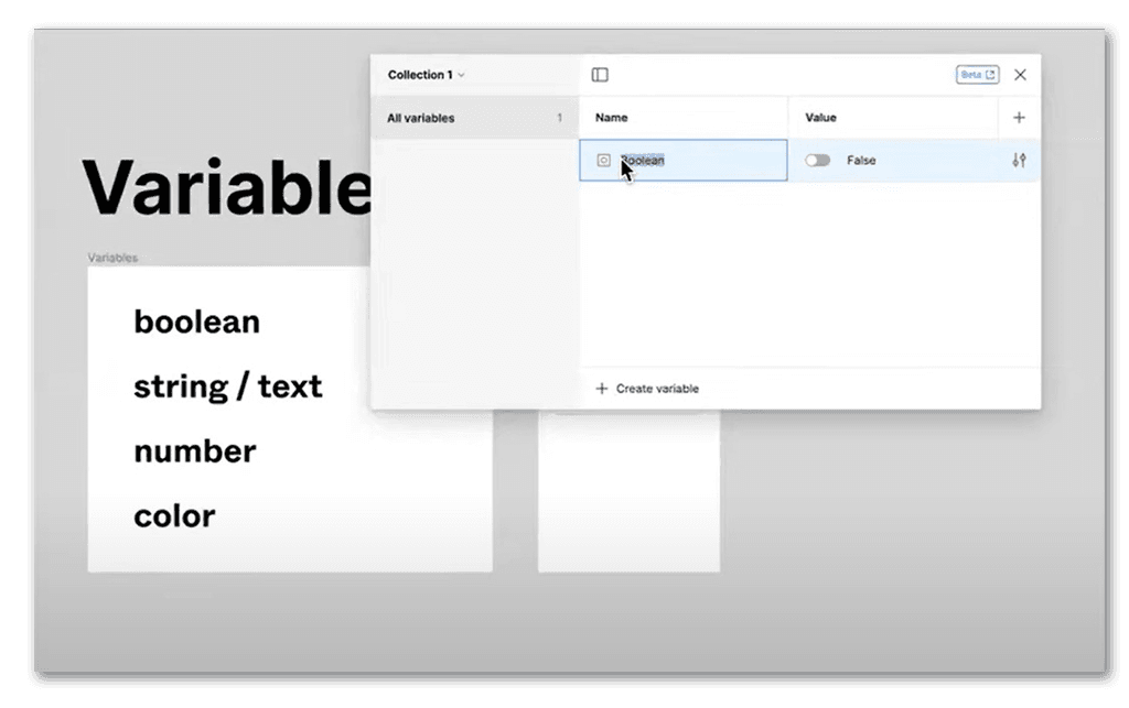
This is where Figma has found the sweet spot to play hero and introduced the concept of a ‘variable.’ A Figma user can input variable data classified under four categories – String, Boolean, Number, and Color. These variables allow designers to create dynamic prototypes that adapt in response to user interactions. Not only does it make the prototypes more realistic but also achieves better results with less time and a limited number of frames.
Expressions play a pivotal role in enhancing the capabilities of prototypes. They empower designers to generate dynamic text or numerical values and evaluate boolean expressions, thereby enhancing the interactivity of the prototypes.
This approach unlocks a range of possibilities for the users. Here are some examples:
- Creating a shopping cart prototype that performs automatic calculations of the total purchase amount, updating in real-time as users add or remove items.
- Exerting control over object dimensions or scaling, as seen in volume controls or dynamic progress bars, through variable manipulation.
- The dynamic manipulation of text strings based on user interactions, providing a versatile means to showcase dynamic content within prototypes.
If you look closely, you’ll notice how these features are starting to sound more developer-friendly than design-friendly.

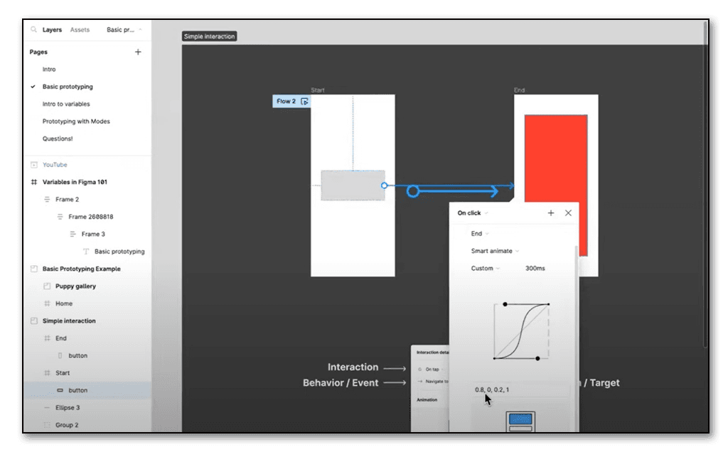
Source: Figma
Figma Variables and Use Cases
Now let’s understand how each variable type can be used in real-world app prototypes.
String Variables
Just like the strings in your dev codes, this variable also allows users to input a sequence of letters, numbers, or characters, which Figma would use to apply its logic. More commonly used to store text data, these variables are particularly useful for creating dynamic and responsive user interfaces and adding a layer of sophistication to your prototypes.
For instance, if you need to prototype different login user interfaces based on the kind of user roles, the traditional approach would require you to duplicate screens and edit them for each role setting. But with Figma’s Conditional Logic, you only need to design one login screen and then simply call the desired user role setting. Figma would display the screen setting saved for each role. The same goes for an admin panel or a customer dashboard that needs personalization.
Number Variables
This variable category simply refers to numerical data that needs to be specifically displayed within an app prototype. Want to display different prices for different combinations of products? Want to change the number of products added to the cart? Want your user to keep track of their product/service consumption hours? Use a number variable to give your client an interactive app experience.
For a real-world use case, let’s take an e-commerce shopping app. Calling a number variable allows you to show how the app would function if a user wanted to purchase different quantities of various products and how they would reflect on the cart. Instead of creating a labyrinth of frames for each product quantity and price combination, now all you have to do is apply the variable.
Boolean Variables
Commonly used to represent binary states or conditions, where ‘true’ typically represents a positive or affirmative state, and ‘false’ represents a negative or non-affirmative state, the Boolean variable allows you to display quite a spectrum of functionalities. From taking binary decisions to applying conditional logic (if-else statements), applying Boolean logic to your prototype enhances your prototype experience and makes testing all the more realistic.
For instance, you can call respective display screens for users who have completed bill payments and for those who have not. You can also use this variable to validate any data input by users in forms. Load screens and file upload statuses are other app functionalities that you can display using this variable.

Source: Figma
Color Variables
When designing apps for a global audience that is diverse not just culturally, but also demographically, even the smallest variations in color can make a huge impact on engagement scores. Color variables in Figma make it easier by allowing you to adapt themes based on geographical locations or user preferences.
For instance, imagine you want a holiday theme for your app without changing any user functionalities, but the color must only be applicable for a few days a year and for users in one specific geographic location. Use the color variable to set your theme. This level of personalization enhances user engagement and makes your design more user-centric.
Plenty of Room for Improvement
Now that we know just how powerful and ‘brimming with potential’ Figma’s conditional logic features are, let’s look at some of the imperfections that we noted during our experimentation. We’re sure that Figma is working on it and we can surely see some improvements in the days to come. But until such time, some snags stop the conditional logic feature from replacing the traditional prototyping processes. Here are our top three red flags:
- There’s only so much complexity that Figma’s conditional logic can handle right now. For instance, it does not support nesting conditionals or combining more than two cases within a single conditional statement. This can be a bit annoying and we found that it was easier to code in such functionalities that involved intricate interactions and multiple conditional checks.
- The String variables in Figma come with certain limitations. Special characters in string variables may not behave as expected, which can be problematic for designers working on projects that require special characters in text fields.
- And finally, as pretty as it may seem to display dynamic numbers and prices using the number variable, Figma still can’t perform actual calculations within its conditional logic. Having to do your real-world calculations elsewhere and then coming back to update your prototype – doesn’t that feel like missing the point?
A Future for Design and Development
Despite these imperfections, Figma’s conditional logic features open up a world of possibilities for designers and developers. It’s safe to say that the tool still remains predominantly design-focused and has a long way to go before it can be used fruitfully by developers. Overall, we think the company is moving in the right direction by trying to find a space for itself as a platform that can offer complex no-code functionalities without compromising on design or user experience.
Figma is one of the most iterative and user-friendly design tools trusted by UX and product design teams the world over. At Expeed too, our team comprises Figma specialists who work in collaboration with our UX experts and development team to create powerful applications. As a team that understands that there never really can be a one-size-fits-all solution, especially in design, we work closely with our customers to understand their specific requirements, the expectations of their users, and business goals to design efficient products and engaging experiences. While we are always excited to adopt new technologies and explore the latest features, we make sure to strike a balance between time-tested design processes and groundbreaking innovation.
If you’re looking for a UX specialist to improve your app engagement or need consulting on the latest UX and design technologies, talk to our experts today!

